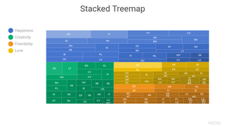
Examples
Tutorial
Intro
This is the tutorial of Vizzu - a free, open-source Javascript library for building animated charts, data stories, and interactive explorers. It is an excellent place to start using Vizzu, as it walks you through the installation and initialization of the library, introduces the logic it employs and the different settings to control how your charts look and behave.
Starting from the Axes, title, tooltip chapter, you can see code snippets, and when you click on them, you can see how the code affects the chart on the right side of the screen.
Installation
Import the library into a JavaScript file or script tag in your web page
<script type="module">
import Vizzu from
  'https://cdn.jsdelivr.net/npm/vizzu@~0.5.0/dist/vizzu.min.js';
</script>
Alternatively, you can install Vizzu from npm
npm install vizzu
Initialization
To show a Vizzu chart create a placeholder element that will contain the rendered chart.
<div id="myVizzu" style="width:800px; height:480px;"></div>
Create a new object instance of the Vizzu class, add it to a variable, initialize the library, and then you can start setting up the first chart by calling the animate method.
let chart = new Vizzu('myVizzu')

chart.initializing.then(
  chart => chart.animate({ /* ... */ })
)
Working with bundlers & frameworks
The published Vizzu package contains a Javascript (vizzu.min.js) and a WebAssembly (cvizzu.wasm) module. By default, the Javascript module tries to load the wasm module from the same path it was imported from.
This behavior won't work with bundlers if they move the wasm file to a different folder. To handle this issue, you can manually set the wasm module's location.
Vizzu.options({ wasmUrl: "/path/to/cvizzu.wasm" })
Note: you should set this path before the Vizzu constructor is called because it loads the wasm module.
Different bundlers will need additional, specific settings to recognize the wasm file as a dependency and handle it correctly. For setting up Vizzu with a specific bundler or framework, check the corresponding how-to/example below:
- Webpack: https://github.com/vizzuhq/vizzu-webpack-demo
- React: https://vizzuhq.github.io/vizzu-react-example/
- Vite: https://github.com/simzer/vizzu-vite-demo
The basic logic of Vizzu
The foundation of a Vizzu chart is the animation. The animation contains states describing the chart's configuration, such as the data series, coordinate system, labels, titles, etc. A static chart is the result of a single animation state. When there are more states, Vizzu automatically transitions between these. The animate method initiates the animation into a new state by describing the new chart and how Vizzu should transition to it. The return value of the animate method is a promise that will be resolved after the animation is completed. Using this logic you can create a promise chain of animation from state to state.

The animate method has two parameters in total. The first parameter sets the chart, and the (optional) second determines how Vizzu should animate to that state.
The first parameter has the following three properties:
- data - this is where you add the data that you want to put on the charts.
- config - this is where you can add or remove series on the channels and set the general settings of the chart like the chart title, the geometry, the alignment etc.
- style - this is where you can set how your chart looks.
Data types
Vizzu currently supports two types of data series: dimensions and measures. Dimensions slice the data cube Vizzu uses, whereas measures are values within the cube.
Dimensions are categorical series that can contain strings and numbers, but both will be treated as strings. Temporal data such as dates or timestamps should also be added as dimensions. Vizzu will draw the elements on the chart in the order they are provided in the data set by default. Thus we suggest adding temporal data in a sorted format from oldest to newest.
Measure in the current beta phase can only be numerical.
Adding data
There are multiple ways you can add data to Vizzu:
- Specified by series - column after column if you think of a spreadsheet
- Specified by records - row after row.
- Data cube form
Elements with a missing value should contain the number zero. 'null', 'undefined' and empty cells will result in an error. In case of dimensions, add '' as a value to have a category without a name.
In the first two cases, data has to be in first normal form. Here is an example of that:
| Genres | Kinds | Popularity |
|---|---|---|
| Pop | Hard | 114 |
| Rock | Hard | 96 |
| Jazz | Hard | 78 |
| Metal | Hard | 52 |
| Pop | Smooth | 56 |
| Rock | Smooth | 36 |
| Jazz | Smooth | 174 |
| Metal | Smooth | 121 |
| Pop | Experimental | 127 |
| Rock | Experimental | 83 |
| Jazz | Experimental | 94 |
| Metal | Experimental | 58 |
In the type parameter, you can set if a series is a dimension or a measure. Adding the type parameter is optional. If omitted, Vizzu will automatically select the type depending on the first element of the values array using the typeof operator. If the value is a number, it will be declared as a measure, in any other case, a dimension.
Data specified by series:
let data = {
  series: [
    {
      name: 'Genres',
      type: 'dimension',
      values: [
        'Pop', 'Rock', 'Jazz', 'Metal',
        'Pop', 'Rock', 'Jazz', 'Metal',
        'Pop', 'Rock', 'Jazz', 'Metal'
      ]
    },
    {
      name: 'Kinds',
      type: 'dimension',
      values: [
        'Hard', 'Hard', 'Hard', 'Hard',
        'Smooth', 'Smooth', 'Smooth', 'Smooth',
        'Experimental', 'Experimental', 'Experimental', 'Experimental'
      ]
    },
    {
      name: 'Popularity',
      type: 'measure',
      values: [ 114, 96, 78, 52, 56, 36, 174, 121, 127, 83, 94, 58 ]
    }
  ]
};
Data specified by records:
let data = {
  series: [
    { name: 'Genres', type: 'dimension' },
    { name: 'Kinds', type: 'dimension' },
    { name: 'Popularity', type: 'measure' }
  ],
  records: [
    ['Pop', 'Hard', 114],
    ['Rock', 'Hard', 96],
    ['Jazz', 'Hard', 78],
    ['Metal', 'Hard', 52],
    ['Pop', 'Smooth', 56],
    ['Rock', 'Smooth', 36],
    ['Jazz', 'Smooth', 174],
    ['Metal', 'Smooth', 121],
    ['Pop', 'Experimental', 127],
    ['Rock', 'Experimental', 83],
    ['Jazz', 'Experimental', 94],
    ['Metal', 'Experimental', 58],
  ]
};
Data cube:
| Genres | |||||
|---|---|---|---|---|---|
| Pop | Rock | Jazz | Metal | ||
| Kinds | Hard | 114 | 96 | 78 | 52 |
| Smooth | 56 | 36 | 174 | 121 | |
| Experimental | 127 | 83 | 94 | 58 | |
| Popularity | |||||
let data = {
    dimensions: [
        { name: 'Genres', values: [ 'Pop', 'Rock', 'Jazz', 'Metal' ] },
        { name: 'Kinds', values: [ 'Hard', 'Smooth', 'Experimental' ] }
    ],
    measures: [
        {
            name: 'Popularity',
            values: [
                [ 114, 96, 78, 52 ],
                [ 56, 36, 174, 121 ],
                [ 127, 83, 94, 58 ]
            ]
        }
    ]
};
You should set the data in the first animate call:
chart.animate({ data });
Axes, title, tooltip
To build a chart with Vizzu, you have to add data series to the channels.
The first step is to create a simple column chart, adding one of the dimensions (Genre) to the x-axis and the measure (Popularity) to the y-axis using the set property.

chart.animate({
    config: {
        channels: {
            y: { set: ['Popularity'] },
            x: { set: ['Genres'] }
        }
    }
})
In the next step, the chart is rearranged by putting both series on the y-axis using once again the set property, resulting in a single column chart. Vizzu automatically animates between the initial state and this one.
chart.animate({
    config: {
        channels: {
                x: { set: null },
                y: { set: ['Genres','Popularity'] }
        }
    }
})
Instead of set, you can use attach and detach to add or remove series to/from the channels.
chart.animate({
    config: {
        channels: {
            y: { detach: ['Popularity'] },
            x: { attach: ['Popularity'] }
        }
    }
})
Using attach & detach makes it easier to build your animated charts step-by-step, however you either have to keep in mind what you had on which channel in the previous step or add the following code to access the actual configuration of the chart.
console.log(chart.config);
Setting the chart title with the title command.
chart.animate({ title:'My first chart' })
Switching on the tooltips that appear on the chart elements when the user hovers over them with their mouse by adding the (tooltip, true) parameters to the chart.feature method. Note: calls to this method before the library initialization completed will fail.
chart.feature('tooltip',true)
Geometry
In Vizzu you can set the geometric elements used to represent your data by the geometry property within the config object.
Switching the geometry to area.
chart.animate({
    config: {
        geometry: 'area'
    }
})
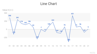
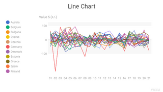
Drawing a line chart.
chart.animate({
    config: {
        geometry: 'line'
    }
})
Switching the geometry to circle. This setting is the most useful when used together with the size channel, as shown in the next chapter of the tutorial.
chart.animate({
    config: {
        geometry: 'circle'
    }
})
Rectangle geometry is the default setting in Vizzu, used for most common charts like bar and column charts.
chart.animate({
    config: {
        geometry: 'rectangle'
    }
})
Channels & legend
Besides the x-axis and the y-axis, there are five more channels in Vizzu you can use to visualize your data. Similarly to the axes you can put any number of dimensions and/or one measure to a channel. In the following example the four most commonly used channels are shown. The fifth, noop channel is introduced later in the Without coordinates & noop channel chapter.
Data on the label channel will be written on the markers on the chart. Vizzu automatically determines the best way to position these labels, but you can set them differently with the style object introduced in the Color palette & fonts chapter.
chart.animate({
    config: {
        channels: {
            label: { attach: ['Popularity'] }
        }
    }
})
The lightness channel sets the lightness of the markers. In this case the same measure (Popularity) is added to it that is on the y-axis, meaning that columns’ height and lightness represent the same values. The legend for the lightness channel is turned on using the legend property.
Note: This is an example when we explicitly instruct Vizzu to show the legend. By default Vizzu automatically shows/hides the legend when it's necessary. You can also turn it off with the legend : null command or set back to automatic mode with legend : 'auto'.
chart.animate({
    config: {
        channels: {
            lightness: { attach: ['Popularity'] }
        },
        legend: 'lightness'
    }
})
The color channel sets the color of the markers. The same dimension (Genres) is put on it that is on the x-axis resulting in each bar having a different color. If a measure is put on the color channel, a color range will be used.
Note: The value on the lightness channel is removed in this step as it doesn’t make sense to use it together with the color channel in this case.
chart.animate({
    config: {
        channels: {
            lightness: { set: null },
            color: { attach: ['Genres'] }
        },
        legend: 'color'
    }
})
The size channel sets the size of the markers if the geometry is circle - where size sets the radius of the circles - or line - where size determines line width. It is ignored when using rectangle or area geometry. This is why we change the geometry to circle in the example.
chart.animate({
    config: {
        channels: {
            size: { set: ['Popularity'] }
        },
        geometry: 'circle'
    }
})
Group/stack
When you add dimensions to the channels, there is a simple rule to keep in mind in the current beta phase of Vizzu. The following example also shows how to group and stack elements of a bar chart.
The rule: When you add a dimension (Type) to a channel (x-axis) with only dimensions on it, Vizzu will fade between the states, as shown here. Thus, you get a grouped bar chart, but the connection between the original state and this one will be unclear for the viewer because of the fading.
chart.animate({
    config: {
        channels: {
            x: { set: ['Genres', 'Kinds'] },
            color: { attach: ['Kinds'] }
        }
    }
})
Let’s get back to the original state by removing the extra dimension - Vizzu will also simply fade between these states.
chart.animate({
    config: {
        channels: {
            x: { detach: ['Kinds'] },
            color: { set: null }
        }
    }
})
The right way is to add the new dimension to the same channel where the measure is: the y-axis. However, since doing only this would result in multiple column chart elements with the same color stacked on top of each other, we also add the same dimension (Type) to the color channel.
chart.animate({
    config: {
        channels: {
            y: { attach: ['Kinds'] },
            color: { attach: ['Kinds'] }
        }
    }
})
By detaching this newly added dimension from the y-axis and attaching it to the x-axis, you get to the same grouped bar chart as in the first step but in a way that is easy to follow for the viewer.
chart.animate({
    config: {
        channels: {
            y: { detach: ['Kinds'] },
            x: { attach: ['Kinds'] }
        }
    }
})
To stack a grouped chart, you just have to do the same thing the other way around: detach the dimension from the x-axis and attach it to the y-axis.
chart.animate({
    config: {
        channels: {
            x: { detach: ['Kinds'] },
            y: { attach: ['Kinds'] }
        }
    }
})
Sorting
Vizzu provides multiple options to sort data. By default, the data is sorted by the order it is added to Vizzu. This is why we suggest to add temporal data such as dates in chronological order - from oldest to newest.
You can also sort the elements by value, which will provide you with an ascending order.
chart.animate({
    config: {
        sort: 'byValue'
    }
})
If you want descending order instead, you have to set the reverse parameter to true. When used without setting the sorting to byValue, the elements will be in the opposite order than they are in the data set added to Vizzu.
chart.animate({
    config: {
        reverse: true
    }
})
This is how to switch back to the default sorting.
chart.animate({
    config: {
        sort: 'none',
        reverse: false
    }
})
When you have more than one dimension on a channel, their order determines how the elements are grouped.
chart.animate({
    config: {
        channels: {
            y: { detach: ['Kinds'] },
            x: { set: ['Genres', 'Kinds'] }
        }
    }
})
When switching the order of dimensions on the x-axis Vizzu will rearrange the elements according to this new logic.
chart.animate({
    config: {
        channels: {
            x: { set: ['Kinds', 'Genres'] },
        }
    }
})
Align & range
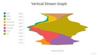
Vizzu offers different options to align your chart elements and to set the range of values shown on the axes. Alignment can be used to create charts like a stream chart where the elements are vertically centered. A good example for using range is when you fix the y-axis so that it would not adapt to the data being shown.
Centered alignment. The effect of this parameter depends on the orientation of the chart. For example, on a column chart, elements will be vertically centered, whereas on a bar chart, horizontally.
chart.animate({
    config: {
        align:'center'
    }
})
Stretched alignment. This way the elements will proportionally fill the entire plot area, effectively showing proportions in stacked charts. This is why the scale will also switch from values to percentages when used.
chart.animate({
    config: {
        align:'stretch'
    }
})
Getting back to the default alignment.
chart.animate({
    config: {
        align:'none'
    }
})
You can set the range of an axis by setting the minimum and maximum values of it. Both parameters are optional so that you can set only one of those, and you either set specific values or a relative value by adding the % sign. In this example, we set the range of the y-axis in a way that the max value is 150% of the biggest element’s value.
chart.animate({
    config: {
        channels: {
            y: { range: { max: '150%' } }
        }
    }
})
You can also set the range for an axis with a dimension on it. You can even use this feature to filter certain elements, just like in the following example.
chart.animate({
    config: {
        channels: {
            x: {
                range: {
                    min: -2,
                    max: 3
                }
            }
        }
    }
})
Ranges have certain defaults depending on the chart's configuration, based on common data viz guidelines because we wanted to make it easy for you to create sleek charts. For example, in the cartesian coordinate system, the range will be automatically set to the max:110% for an axis with a measure on it. Polar coordinates work differently, as you can see for yourself in the Orientation, split & polar chapter.
Whenever you want to set your ranges back to the default value, just set them to ‘auto’.
chart.animate({
    config: {
        channels: {
            x: {
                range: {
                    min: 'auto',
                    max: 'auto'
                }
            },
            y: {
                range: {
                    max: 'auto'
                }
            }
        }
    }
})
Aggregate/drill-down
These features basically mean that you add or remove an additional dimension to/from an axis or another channel. As you can see below, there are some important things to keep in mind when you use them.
Let’s stack together the elements by putting the Genres dimension from the x-axis to the y-axis. At the end of this phase, there are chart elements with the same color stacked on top of each other, which is something you would want to avoid.
chart.animate({
    config: {
        channels: {
            y: { attach: ['Genres'] },
            x: { set: null }
        }
    }
})
By taking the Genres off of the y-axis, only one chart element remains for every color, and Vizzu automatically calculates and shows the aggregate value of the elements.
Note: Instead of taking the unwanted dimension down from the chart, Genres could have been added to the lightness channel to differentiate the chart elements.
chart.animate({
    config: {
        channels: {
            y: { detach: ['Genres'] }
        }
    }
})
To drill-down, the same dimension is put back on the y-axis, which results in a state that we suggest you to only use temporarily when in transition.
chart.animate({
    config: {
        channels: {
            y: { attach: ['Genres'] }
        }
    }
})
We group the elements by putting once again the Genres dimension on the x-axis.
chart.animate({
    config: {
        channels: {
            y: { detach: ['Genres'] },
            x: { set: ['Genres'] }
        }
    }
})
Orientation, split & polar
Now that you are familiar with the basic logic and operation of Vizzu, let's dive in with some more advanced features that you can use to create animated data stories and show the data from different perspectives.
Switching orientation means that you put a measure from one axis to the other to see the data from a different perspective. This is once again a state you should only use temporarily.
chart.animate({
    config: {
        channels: {
            y: { detach: ['Popularity'] },
            x: { attach: ['Popularity'] }
        }
    }
})
By turning the split parameter on, you can see stacked elements side-by-side, which enables the comparison of the components.
chart.animate({
    config: {
        split: true
    }
})
Merging the components by turning the split parameter off.
chart.animate({
    config: {
        split: false
    }
})
We aggregate the data by removing the Genres dimension from the x-axis.
chart.animate({
    config: {
        channels: {
            x: { detach: ['Genres'] }
        }
    }
})
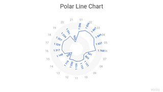
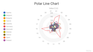
Switching from cartesian coordinates to polar. When doing so, it is worth setting the axis range on the axis with the dimension so that the viewers can easily compare the values shown. If you want to return to the default cartesian coordinates, just set the coordSystem parameter to ‘cartesian’.
Note: The range of the x-axis is automatically set to max:133% as this is the standard way to show radial charts.
chart.animate({
    config: {
        channels: { y: { range: { min: '-30%' } } },
        coordSystem: 'polar'
    }
})
Filtering & adding new records
Filtering enables you to zoom in or out within a chart, allowing the viewer to focus on certain selected elements, or get more context. You can also add new records to the data on the chart which makes it easy to work with real-time sources.
We add two items from the Genres dimension - using the || operator - to the filter, so the chart elements that belong to the other two items will vanish from the chart.
chart.animate({
    data: {
        filter: record =>
            record["Genres"] == 'Pop'
            || record["Genres"] == 'Metal',
    }
})
Now we add a cross-filter that includes items from both the Genres and the Kinds dimensions. This way we override the filter from the previous state. If we weren't update the filter, Vizzu would use it in subsequent states.
chart.animate({
    data: {
        filter: record =>
            (record["Genres"] == 'Pop' || record["Genres"] == 'Metal')
            && record["Kinds"] == 'Smooth'
    }
})
Switching the filter off to get back to the original view.
chart.animate({
    data: {
        filter: null,
    }
})
Here we add another record to the data set and update the chart accordingly.
chart.animate({
    data: {
        records: [
          ['Soul', 'Hard', 91],
          ['Soul', 'Smooth', 57],
          ['Soul', 'Experimental', 115],
            ]
    }
})
Note: combining this option with the store function makes it easy to update previously configured states with fresh data since this function saves the config and style parameters of the chart into a variable but not the data.
Without coordinates & noop channel
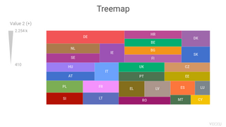
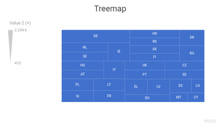
Certain chart types have neither measures nor dimensions on the axes such as treemaps and bubble charts. This is a case when the noop channel comes in handy for grouping and stacking elements in these kinds of charts.
To get to a treemap, we have to detach all dimensions and the measure from the axes and put two of them on the size channel, whereas the other dimension is still on the color channel. Since the same dimensions are used in both cases Vizzu will be able to animate between these states.
chart.animate({
    config: {
        channels: {
            y: { set: null },
            x: { set: null },
            size: { attach: ['Genres', 'Popularity'] }
        }
    }
})
Getting from a treemap to a bubble chart is simply by changing the geometry to circle. This bubble chart is stacked by the Type dimension that is on the size channel - this is why the bubbles are in separate, small groups.
chart.animate({
    config: {
        geometry: 'circle'
    }
})
In order to show all bubbles as one group, we use the noop (no operations) channel for the Genres dimension. The noop channel enables us to have a dimension on the chart, that doesn’t affect any parameter of the elements, only their count.
chart.animate({
    config: {
        channels: {
            size: { detach: ['Genres'] },
            noop: { set: ['Genres'] }
        }
    }
})
Color palette & fonts
This and the next chapter provide a quick intro to the styling of the charts. You can either use the style property like in the following examples or use CSS. By using CSS, it's easier to set the same style for multiple charts on one page or re-use style settings.
If you use CSS, don't change the set parameters later on via the style property.
The font sizes automatically adjust to the chart size to help readability, and can also be set separately or for specific groups.
The actual style settings of the chart can be accessed via the style property.
console.log(chart.style);
The color palette is changed to the colors we add here. The order of the dimension’s
items in the data set determine which color belongs to which item as the colors are added one-by-one.
If you want to use the same setting via CSS, you should add --vizzu-plot-marker-colorPalette: #9355e8FF #123456FF #BDAF10FF;
chart.animate({
    style: {
        plot: {
            marker: {
                colorPalette: '#9355e8FF #123456FF #BDAF10FF'
            }
        }
    }
})
Changing the title font size will only affect the title; all other font sizes remain the same.
CSS version: --vizzu-title-fontSize: 50;
chart.animate({
    style: {
        title: {
            fontSize: 50
        }
    }
})
This is how to set the font size back to its default value.
chart.animate({
    style: {
        title: {
            fontSize: null
        }
    }
})
In case you change the font size of the whole chart with the top-level fontSize parameter then every font on the chart will grow/shrink proportionally. The size refers to the font size of the axis labels by default.
chart.animate({
    style: {
        fontSize: 20
    }
})
You can reset styles to default on any levels by setting them to null.
chart.animate({
    style: null
})
For information on all available style parameters see the reference documentation.
Chart layout
Vizzu has three separate parts of the chart layout: the plot area that contains the chart, the title containing the chart title on the top, and the legend on the left. Vizzu automatically hides the legend when it’s unnecessary to show it. When the title is not in use, Vizzu hides that part automatically as well. Each of these parts have their own paddings on all four sides that adjust to the chart size by default, but can also be set with the appropriate settings in the style object. All size parameters can be set in pixel, percentage and em.
We add different background colors to the parts of the layout to show how they are aligned.
chart.animate({
    style: {
        title: { backgroundColor: '#A0A0A0' },
        plot: { backgroundColor: '#D2D2D2' },
        legend: { backgroundColor: '#808080' },
    }
})
Setting the width of the legend.
chart.animate({
    style: {
        legend: {
            width: 50
        }
    }
})
Setting the legend width back to its default value.
chart.animate({
    style: {
        legend: {
            width: null
        }
    }
})
Changing the title paddings. By default, the title is horizontally centered above the chart. In this example, we set the title’s left padding, resulting in the text moving to the right.
chart.animate({
    style: {
        title: {
            paddingTop: 20,
            paddingBottom: 20,
            paddingLeft: 200
        }
    }
})
Setting the title paddings back to their default values.
chart.animate({
    style: {
        title: {
            paddingTop: null,
            paddingBottom: null,
            paddingLeft: null
        }
    }
})
Changing the paddings of the plot area to position the plot. The texts on the axes are drawn on the padding of the plot and not the plot itself.
chart.animate({
    style: {
        plot: {
            paddingLeft: 100,
            paddingRight: 100
        }
    }
})
Setting the plot paddings back to their default values.
chart.animate({
    style: {
        plot: {
            paddingLeft: null,
            paddingRight: null
        }
    }
})
Animation options
In Vizzu you can set the timing and duration of the animation. You can do this either for the whole animation, or for animation groups such as the elements moving along the x-axis or the y-axis, appearing or disappearing or when the coordinate system is changed.
Let’s see first a simple example when a stacked column chart is grouped using the default animation options.
chart.animate({
    config: {
        channels: {
            y: { detach: ['Kinds'] },
            x: { attach: ['Kinds'] }
        }
    }
})
We stack the columns, still with the default options.
chart.animate({
    config: {
        channels: {
            x: { detach: ['Kinds'] },
            y: { attach: ['Kinds'] }
        }
    }
})
Now we change the animation settings for the elements moving along the y-axis and also the change in styles, more specifically when the labels on the markers move from the center of the chart elements to the top of them.
chart.animate({
    config: {
        channels: {
            y: { detach: ['Kinds'] },
            x: { attach: ['Kinds'] }
        }
    }
},
{
    y: {
        duration: 2,
        delay: 2
    },
    style: {
        duration: 2,
        delay: 4
    }
})
This is an example of changing the settings for the whole animation at once.
chart.animate({
    config: {
        channels: {
            x: { detach: ['Kinds'] },
            y: { attach: ['Kinds'] }
        }
    }
},
{
    duration: 1,
    easing: 'linear'
})
When the two settings are combined, Vizzu will use the general animation options and spread the unique settings for specific groups proportionally. This is why you can see the same animation as two steps before but happening much quicker since the duration of the whole animation is set to 1 second.
chart.animate(
{
    config: {
        channels: {
            x: { attach: ['Kinds'] },
            y: { detach: ['Kinds'] }
        }
    }
},
{
    duration: 1,
    easing: 'linear',
    y: {
        duration: 2,
        delay: 2
    },
    style: {
        duration: 2,
        delay: 4
    }
})
In case you only want to change the duration of the animation, you can use the following, simplified format to do that.
chart.animate(
{
    config: {
        channels: {
            x: { detach: ['Kinds'] },
            y: { attach: ['Kinds'] }
        }
    }
}, '500ms')
Animation control
Using the result object provided by the chart's animate method you can play, pause, stop, seek or reverse the animations.
In this step, we set an event that pauses the animation when it reaches 75% of progress and seeks back to 25% of progress, then restarts the animation from there.
let animation = chart.animate({
    config: {
        channels: {
            x: { attach: ['Kinds'] },
            y: { detach: ['Kinds'] }
        }
    }
});

function onUpdate(event) {
    if (event.data.progress > 0.75) {
        animation.pause();
        chart.off('update', onUpdate);
        setTimeout(() => {
            animation.seek('25%').play();
        }, 1000);
    }
};

chart.on('update', onUpdate);
Events
You can register handlers for various events. There are mouse events (click, mouseon), animation events (begin, update, complete), and rendering events that are called before rendering the chart elements. Handlers can be registered/unregistered with the on(), off() method pair.
We are registering a handler for the click event which will show an alert block with information about the clicked marker.
function clickHandler(event)
{
    alert(JSON.stringify(event.data));
}
chart.on('click', clickHandler);
Unregistering the previously registered handler.
chart.off('click', clickHandler);
Here we override the axis label color for 'Jazz' to red and all others to gray.
function labelDrawHandler(event)
{
    event.renderingContext.fillStyle =
        (event.data.text === 'Jazz') ? 'red' : 'gray';
}
chart.on('plot-axis-label-draw', labelDrawHandler);
Unregistering the previously registered handler.
chart.off('plot-axis-label-draw', labelDrawHandler);
The default behaviour of all events can be blocked by calling the event's preventDefault() method. Here we block the drawing of the Vizzu Logo in the bottom right corner of the chart.
function logoDrawHandler(event)
{
    event.preventDefault();
}
chart.on('logo-draw', logoDrawHandler);
Unregistering the previously registered handler.
chart.off('logo-draw', logoDrawHandler);
Shorthands & Store
To assist you with the development we added various shorthands that will make your code more compact. And we also added the store function, which enables you to save a chart state into a variable that you can reuse later instead of setting up that state once again.
If you don't use the data and style properties in the first parameter of the animate method, you can simplify your code by using only the object of the config property.
chart.animate({
// config: {
    align:'stretch'
// }
})
Let's save this state by calling the store function.
var snapshot;
snapshot = chart.store();
If you set/attach/detach just one series on a channel, you don't have to put that series into an array.
chart.animate({
    channels: {
        // x: { attach: [ 'Kinds' ] },
        x: { attach: 'Kinds' },
        y: { detach: 'Kinds' }
    },
    align: 'none'
})
If you use set on a channel and no other options like range, you don't have to express that channel as an object. If you only set one series on a channel you can simply write the series' name after the channel name.
chart.animate({
    channels: {
        // y: { set: [ 'Kinds', 'Popularity' ] },
        y: [ 'Kinds', 'Popularity' ],
        x: 'Genres'
    }
})
In any case, you can simply omit the the channel object, Vizzu will automatically recognize the channels by their names.
chart.animate({
// channels: {
    y: 'Kinds',
    x: ['Genres','Popularity']
// }
})
Instead of creating nested objects, you can set the styles like this.
chart.animate({
    style: {
        // plot: { xAxis: { label: { fontSize: '150%' } } }
        'plot.xAxis.label.fontSize': '150%',
        'title.backgroundColor': '#A0A0A0'
    }
})
This is how you can get back to a state that you previously stored.
chart.animate(snapshot)
Chart presets
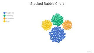
Throughout this tutorial, we have shown you how to create charts with Vizzu using a chart type-agnostic, uniform way without being limited to a predefined set of available charts. But sometimes, when you know the chart type you want to use, it is easier to start with that and skip configuring it from scratch. For this reason, Vizzu provides preset chart configurations for many known chart types. See the preset galery for all available presets.
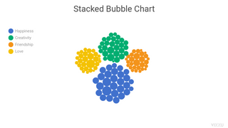
Use the methods of the 'presets' static property of the Vizzu class to build a chart based on a preset. These methods return chart configuration objects that can be passed to the 'animate' method. For example, this is how to create a stacked bubble chart using its preset.
chart.animate(Vizzu.presets.stackedBubble({
    size: 'Popularity',
    color: 'Kinds',
    stackedBy: 'Genres'
}))
Presets will override all channels, removing all previously set series from the chart. Using a preset will also explicitly set most chart configuration parameters. Exceptions to this are the 'legend', 'title', 'reverse', and 'sort' properties that can be set while using a preset. Here's an example of a preset where chart elements are sorted by value.
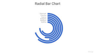
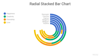
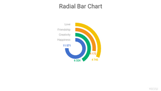
chart.animate(Vizzu.presets.radialStackedBar({
    angle: 'Popularity',
    radius: 'Genres',
    stackedBy: 'Kinds',
    sort: 'byValue'
}))
As you will see, the preset doesn't override the previously configured sorting and wouldn't affect the rest of the chart config parameters mentioned above either.
Presets will affect chart configuration, but you might also want to set the style or the underlying data. In this case, you can use the more verbose syntax below, explicitly passing the preset to the 'config' property of the animate method's parameter.
chart.animate({
    config: Vizzu.presets.radialBar({
        angle: 'Popularity',
        radius: 'Genres',
    }),
    style: {
        'plot.xAxis.interlacing.color': '#ffffff00'
    }
})